
Mastering Color Theory: Your Essential Guide for Modern Design Success
Color theory is more than just aesthetics; it's a critical skill for every modern designer. Learn the core principles to create impactful, visually compelling designs that resonate with audiences.
By Rollan Bañez · August 29, 2026 · 8 min read
In an increasingly visual world, the ability to wield color effectively is not just an art, but a strategic necessity. For modern designers, understanding color theory fundamentals goes beyond picking pleasing shades; it’s about crafting compelling narratives, influencing emotions, and enhancing user experiences. This foundational knowledge is crucial in an era where digital interfaces and branding are paramount.
Ignoring color theory can lead to design inconsistencies, diluted messages, and a lack of professional impact. This guide will equip you with the essential principles to ensure your designs always hit the mark, whether you're working on a website, a brand identity, or a marketing campaign. Let's dive into the vibrant world of color.
The Enduring Power of Color Theory
Color theory is a timeless framework of rules and guidelines that designers use to communicate effectively with color. It delves into how colors combine, contrast, and change our perceptions, providing a scientific basis for aesthetic choices. While ancient artists intuitively understood color, figures like Isaac Newton formally organized these concepts, leading to the color wheel we know today.
Today, with an explosion of digital platforms and design tools, these principles are more relevant than ever. From web interfaces to motion graphics, informed color choices can significantly impact user engagement and brand recognition. Mastery of this area is a hallmark of truly professional work.
Defining the Core Elements
At its heart, color theory revolves around three fundamental properties: hue, saturation, and brightness (or value). Understanding these elements is the first step to becoming a color master.
- Hue: This refers to the pure color itself, like red, blue, or yellow. It's what distinguishes one color from another on the spectrum.
- Saturation: Also known as intensity, saturation describes the purity or vividness of a color. A highly saturated color is vibrant and rich, while a desaturated color appears muted or grayish.
- Brightness (Value): This property indicates how light or dark a color appears. Adding white increases brightness (tint), while adding black decreases it (shade).
Manipulating these properties allows designers infinite possibilities in creating diverse palettes and visual moods. It’s the difference between a flat design and one that truly pops with depth and character.
Understanding Color Relationships: The Color Wheel
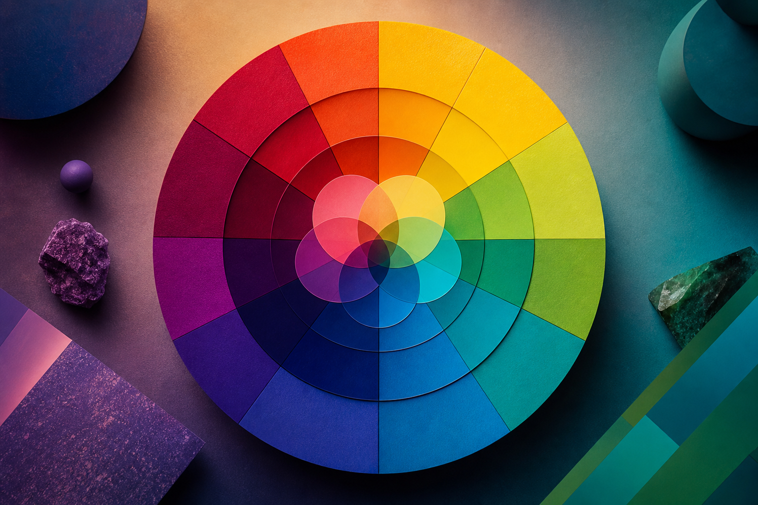
The color wheel is an indispensable tool, organizing hues in a circular diagram to illustrate their relationships. It forms the backbone of creating harmonious and impactful color schemes. Mastering its use is vital for any designer seeking to develop strong Adobe Creative Cloud skills.
Primary, Secondary, and Tertiary Colors
The color wheel begins with foundational hues:
- Primary Colors: Red, blue, and yellow. These cannot be created by mixing other colors and are the building blocks for all other colors.
- Secondary Colors: Orange, green, and violet. These are formed by mixing two primary colors (e.g., red + yellow = orange).
- Tertiary Colors: Red-orange, yellow-orange, yellow-green, blue-green, blue-violet, and red-violet. These are created by mixing a primary and a secondary color.
This hierarchical structure provides a logical framework for understanding how colors derive from one another. It's the starting point for developing complex palettes.
Key Color Schemes for Modern Design
Applying color relationships from the wheel allows for the creation of various schemes, each with its own aesthetic and psychological impact:
- Monochromatic: Uses different tints, tones, and shades of a single hue. This scheme creates a subtle, cohesive, and sophisticated look.
- Analogous: Combines colors that are next to each other on the color wheel (e.g., blue, blue-green, green). These schemes are often found in nature and are inherently harmonious and soothing.
- Complementary: Pairs colors directly opposite each other on the color wheel (e.g., red and green, blue and orange). This creates high contrast and visual excitement, making elements stand out.
- Triadic: Uses three colors equally spaced around the color wheel. This scheme offers vibrant contrast while maintaining balance, often creating bold and playful designs.
- Split-Complementary: Uses a base color and the two colors adjacent to its complement. This offers the visual excitement of complementary colors with slightly less tension.
Choosing the right scheme depends entirely on the project's goals, brand identity, and the desired emotional response. Professional designers often experiment with several combinations before finalizing their choices.
The Psychology of Color: More Than Meets the Eye
Color is a powerful non-verbal communicator, deeply influencing emotions, perceptions, and behaviors. Understanding color psychology allows designers to intentionally evoke specific feelings and steer user actions. This is a critical aspect of creating effective user experience design.
Emotional and Cultural Associations
Different colors carry distinct psychological baggage, though cultural contexts can sometimes shift these meanings:
- Red: Passion, energy, urgency, danger, love. Can stimulate appetite (hence its use in food branding).
- Blue: Trust, serenity, stability, wisdom, professionalism. Often used by financial institutions and tech companies.
- Yellow: Happiness, optimism, warmth, caution. Can be attention-grabbing but also perceived as aggressive if overused.
- Green: Nature, growth, health, freshness, wealth, tranquility. Popular for environmental and wellness brands.
- Purple: Royalty, luxury, creativity, mystery, spirituality. Often associated with high-end products and imaginative concepts.
- Orange: Enthusiasm, creativity, determination, warmth. A balance between the energy of red and the cheerfulness of yellow.
- Black: Sophistication, power, elegance, mystery, formality. Can also signify mourning or evil.
- White: Purity, cleanliness, innocence, simplicity, minimalism. Often used to create space and clarity.
Considering these associations is vital when designing for diverse audiences. A color that means luck in one culture might signify mourning in another.
Practical Application for Modern Designers
Applying color theory isn't just academic; it's about making deliberate choices that impact your design's success. Whether you're working on digital interfaces, print media, or branding, these principles guide your decisions.
Branding and Identity
A brand's color palette is one of its most recognizable assets. Think of Coca-Cola's red, McDonald's red and yellow, or Facebook's blue. These choices are far from arbitrary.
Colors evoke immediate emotional responses and create lasting impressions. A well-chosen palette reinforces brand values, aids memorability, and differentiates a company from its competitors. Consistency across all platforms is key to building a strong brand identity.
User Experience (UX) and Accessibility
In digital design, color plays a pivotal role in usability and accessibility. It guides the user's eye, indicates interactive elements, and provides feedback.
- Call-to-Action (CTA) Buttons: Using contrasting, vibrant colors helps CTAs stand out and encourages clicks.
- Hierarchy: Strategic color use can establish visual hierarchy, drawing attention to the most important elements on a page.
- Accessibility: Ensuring sufficient color contrast is critical for users with visual impairments. Tools like WCAG (Web Content Accessibility Guidelines) checkers help designers meet accessibility standards, a topic often covered in creative workshops and training.
Neglecting accessibility can alienate a significant portion of your audience. Inclusive design practices, which include thoughtful color use, are becoming standard requirements in professional design.
Key Takeaways
- Color theory fundamentals are essential for creating impactful and meaningful designs in any medium.
- Mastering hue, saturation, and brightness provides the basic building blocks for all color decisions.
- The color wheel offers a systematic approach to creating harmonious and contrasting color schemes.
- Color psychology allows designers to intentionally influence user emotions and behaviors.
- Effective color application improves brand identity, enhances user experience, and ensures accessibility for all users.
- Continuous learning and practical application are crucial for evolving your color design skills.
The Future of Color in Design
As technology evolves, so does the application of color theory. AI-powered tools are emerging to assist in palette generation and accessibility checks, but human understanding of nuance and emotion remains irreplaceable. Augmented reality (AR) and virtual reality (VR) will present new challenges and opportunities for immersive color experiences. Designers who master Adobe Certified Professional skills, including advanced color management, will be at the forefront of these innovations.
Embrace color theory not as a rigid set of rules, but as a powerful language to tell your design stories. The journey to becoming a color master is ongoing, filled with continuous learning and creative exploration. Begin honing your skills today, and watch your designs come alive with purpose and impact.
Frequently asked questions
- What is the most important aspect of color theory for beginners?
- For beginners, understanding the color wheel and basic color relationships (like complementary, analogous, and monochromatic schemes) is paramount. This provides a practical foundation for creating harmonious and effective color palettes in any design project.
- How does color psychology influence modern branding?
- Color psychology deeply influences modern branding by evoking specific emotions and associations that align with a brand's identity. For instance, blue conveys trust for tech companies, while red signifies energy for fast-food chains. Strategic color choice helps differentiate brands and create memorable, impactful connections with consumers.
- Why is color accessibility important in digital design?
- Color accessibility ensures that designs are usable and understandable by everyone, including individuals with visual impairments or color blindness. It involves using sufficient contrast ratios and not relying solely on color to convey information, making digital content inclusive and compliant with guidelines like WCAG.
- Can AI replace a designer's understanding of color theory?
- While AI tools can assist designers by generating palettes or checking contrast, they cannot fully replace a human designer's nuanced understanding of color theory, cultural context, emotional impact, and project-specific goals. AI serves as a powerful assistant, but the creative and strategic decision-making remains with the designer.